What is Share of Attention (SoA)?
Share of Attention is a proprietary metric from Winnin that estimates the percentage of consumer attention directed towards brands, within a category and country, based on real interactions with videos on platforms like YouTube, TikTok, Instagram, Facebook, and Twitch, updated weekly.
What are the main benefits of Share of Attention (SoA)?
- Precise Brand diagnosis: Visualize clearly and objectively your brand's position and its cultural relevance within the market in which it operates.
- Strategy acceleration: Make faster and more assertive marketing and communication decisions, based on real consumer behavior data.
- Continuous monitoring: Keep your brand updated with changes in the cultural landscape and competitor movements, proactively adapting your strategies.
How is Share of Attention calculated?
The Share of Attention calculation takes into account the following main components, combined to generate an accurate estimate of consumer attention:
- Sentiment: The predominant sentiment expressed in videos related to your brand and competitors, classified as positive, neutral, or negative. (To learn more about sentiment analysis, click here)
- Category and Platform weight: Reflects the specific cultural impact of each market category and video platform within a given country, allowing for a more accurate measurement of the real attention directed to your brand.
- Real engagement: Genuine user interactions with videos, including likes, comments, and shares.
- Content: The analysis covers the performance of content from the brand's own channels (Owned), user-generated content (UGC), and paid campaigns (Paid).
- Country: The calculation is performed in a segmented manner by country, offering localized insights into the dynamics of attention in different markets.
How to access and track Share of Attention (SoA)?
On Mobile:
- Access the Winnin Intelligence website through your mobile browser and enter your credentials to log in.
- Upon accessing your account, in the Category area, you will find your brand's Share of Attention.
 This first block provides a quick overview of your brand's performance in the current month:
- Your attention: The larger number and the donut chart display your brand's Share of Attention percentage for the current month.
- Weekly comparison: Below your attention percentage, you will see the variation in percentage points compared to the previous month.
- Ranking of Top Brands: Next to your brand's indicator, you can see your brand's position and the Share of Attention percentage of some of the main competing brands in the category for the current month.
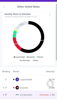 4. To get a detailed view of the attention percentage of all relevant brands in the category for the month under analysis, click the See full ranking button. This will take you to a screen with the complete ranking of brands and their respective Share of Attention.
5.
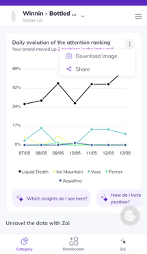 Below the main block, you will find a line graph showing the daily evolution of your brand's and key competitors' attention ranking over the past week.
-
- Visualization by Day: Each colored line represents a different brand. The dots along each line indicate that brand's Share of Attention percentage on a specific day. To view the exact value of a brand on a particular day, simply click on the corresponding dot. A small dialog box or label will appear with the percentage.
- By clicking the button in the upper right corner of this block (represented by a three vertical dots icon), you will have the option to Download image to save the graph to your device or Share to send the visualization to others.
On Desktop:
- Access Winnin Intelligence through your web browser.
- In the left-side menu, click on the Category tab..
- Within the Category tab, the left-side block offers a quick overview of brand performance for the current week in relation to consumer attention:
- Share of Attention: The larger number and the donut chart display your brand's Share of Attention percentage for the current week.
- Monthly comparison: Below your attention percentage, you will see the variation in percentage points compared to the previous month.
- Ranking of top brands: Below the chart, you can see the position of brands and their respective Share of Attention percentage for the current week.
- To the right, you will find a graph showing the distribution of share over previous weeks. In the top right of the graph, you can choose between a column chart or a line chart.
- Each colored slice/line of the graph represents a different brand (identified by the ranking legend).

 6. To analyze a specific period, use the filter in the top right corner of the page and select the best option for you.
In both the mobile and desktop versions, our artificial intelligence, Zai, is available to assist in interpreting the Share of Attention data. Do not hesitate to interact with Zai to ask specific questions about the information presented, understand variations in the ranking, or obtain additional insights into the attention landscape in your category.